 By
By 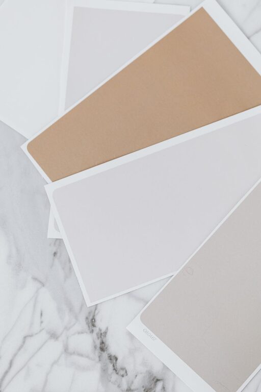
Creating a peaceful and calming atmosphere in your home often starts with the colors you choose for your walls, furniture, and accents. The right calm colors can transform your living space into a retreat where you feel relaxed and refreshed. If you’re considering a color update and want to focus on serenity, this guide will help you choose colors that promote tranquility and comfort.
Why Choose Calm Colors?
Calm colors are typically soft, muted shades that evoke a sense of peace and quiet. These colors can reduce stress and create an environment conducive to relaxation, making them a popular choice for bedrooms, living rooms, and bathrooms. Beyond just looks, calm colors influence mood and can enhance how you feel in your home every day.
Understanding Color Psychology
Before diving into specific shades, it’s helpful to understand a bit about color psychology. Different colors can affect emotions in various ways:
– Blues: Often associated with calmness and stability. Light blue is especially soothing.
– Greens: Represent nature and balance, promoting a restful atmosphere.
– Neutrals: Soft beiges, creams, and greys provide a quiet background that lets other elements shine.
– Lavenders and soft purples: These hues can bring a gentle sense of calm without being too bold.
Selecting calm colors means choosing shades that naturally promote relaxation rather than excitement or intensity.
Tips for Choosing Calm Colors
1. Start with a Neutral Base
Begin by selecting a neutral color for your walls or large furniture pieces. Neutrals like pale beige, soft grey, or off-white provide a versatile foundation that complements other calming colors. They create an open and airy feel while allowing you to add subtle pops of color with decor items.
2. Opt for Soft, Muted Shades
Vibrant or overly bright colors tend to stimulate, so choose muted or pastel versions of your favorite calm tones. For example, instead of bright turquoise, try a pale teal. Rather than deep forest green, select a sage green. These softer shades maintain tranquility without being dull.
3. Consider Cool Tones
Cool colors like light blues, greens, and lavenders generally produce a calming effect. These tones mimic natural elements such as the sky, sea, and plants, which can subconsciously relax your mind.
4. Use Accent Colors Wisely
Calm colors don’t have to mean monotone. You can incorporate accent colors like soft pink, powder blue, or muted coral through pillows, rugs, or artwork. These subtle accents bring warmth and interest without disrupting the peaceful vibe.
5. Test Colors in Different Lighting
Natural and artificial light can change how a color looks in your space. Paint sample swatches on your walls and observe them at different times of the day. This will help you avoid surprises and ensure the color feels calm and inviting all day long.
6. Balance Warm and Cool Tones
Too much cool color can feel cold, while warm colors can make a space feel cozy. Aim for balance by mixing cool-toned walls with warm wood furniture or vice versa. This creates a harmonious environment that feels both restful and welcoming.
7. Layer Colors for Depth
Instead of painting everything the same shade, layer different calm colors in a room. For example, combine a soft blue wall with light grey furniture and cream-colored curtains. This layering adds depth and prevents the space from feeling flat.
8. Don’t Forget Texture
Texture plays a big role in enhancing calm colors. Soft fabrics like linen, cotton, and velvet bring warmth and comfort, while matte paint finishes reduce glare and create a gentle look. Combining color with texture makes your space feel more inviting.
Popular Calm Color Choices for Each Room
Bedrooms
A bedroom is the perfect place to use pale blues, soft greens, or gentle lavenders. These shades help signal your body to unwind and prepare for rest. Complement these colors with soft bedding and minimal clutter.
Living Rooms
Choose warm neutrals or muted greys combined with natural wood tones. Add accents like pale coral or dusty rose to keep the space feeling friendly and relaxed without over-stimulating.
Bathrooms
Light aqua, seafoam green, or crisp off-white can make bathrooms feel fresh and spa-like. Pair these colors with natural stone or wood accents for a soothing experience.
Final Thoughts
Choosing calm colors for your home is about creating a sanctuary that nurtures your well-being. Remember to focus on soft, muted shades, test colors under your room’s lighting, and combine tones with textures for a layered and inviting look. Whether you prefer cool blues or warm neutrals, a carefully curated palette will bring peace and comfort to your daily life.
By taking time to thoughtfully select calming colors, you can turn your home into a place where relaxation comes naturally — a true haven from the hustle and bustle of everyday life. Happy decorating!